
Colour psychology studies how different hues can affect our emotions and perceptions. It also suggests that it can impact our mental health and well-being. We selected some trendy shades and what they represent in inspiring elements.
It is common sense that bright, warm tones such as reds, oranges and yellows stimulate energy and happiness. Meanwhile, subdued colours such as blues, greens and purples are soothing and calming.
When it comes to home interiors, opt for vibrant shades in spaces for entertainment, such as dining rooms and kitchens. For bedrooms and bathrooms, cooler tones will create a relaxing environment.
What we wear can also influence how we feel about ourselves. Maintaining a routine of getting dressed and ready to kick start the day is essential. Despite black being a popular shade, adding a bit of colour here and there can help uplift your mood. It can give you the boost to shift your spirits into a more positive vibration. Find your colour for 2024!
YELLOW: HAPPINESS AND BETTER COMMUNICATION
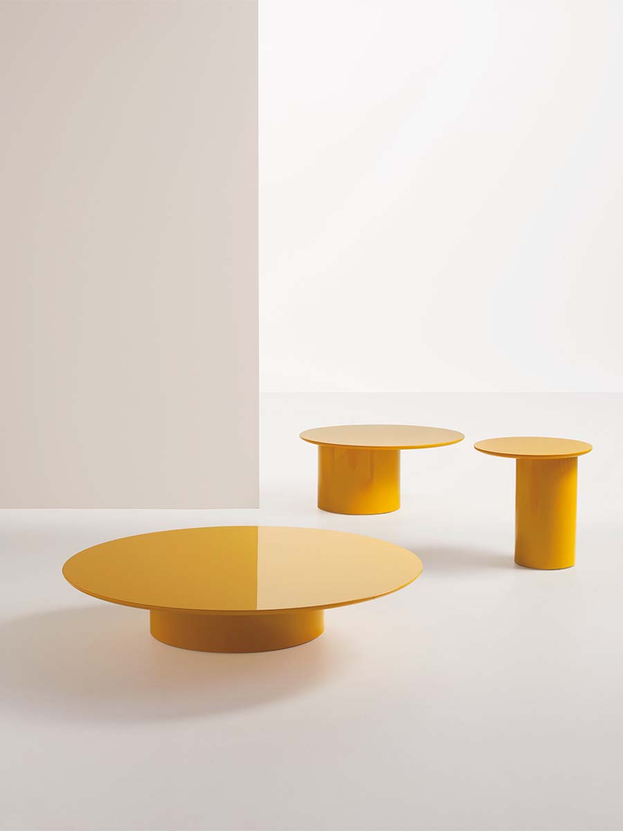
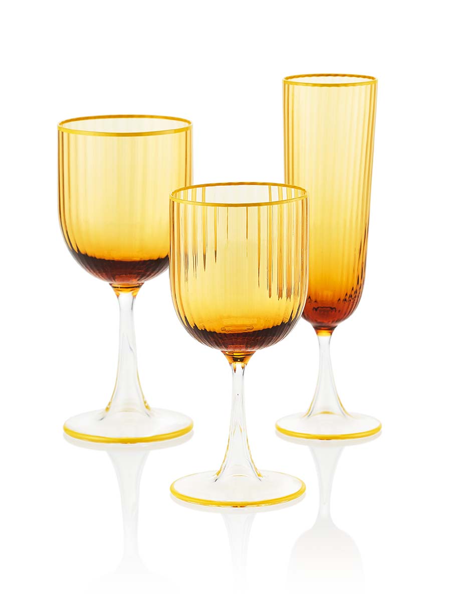
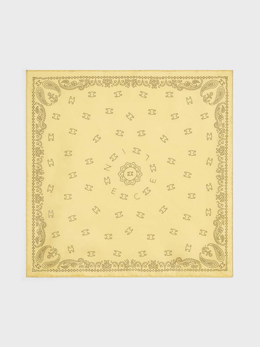
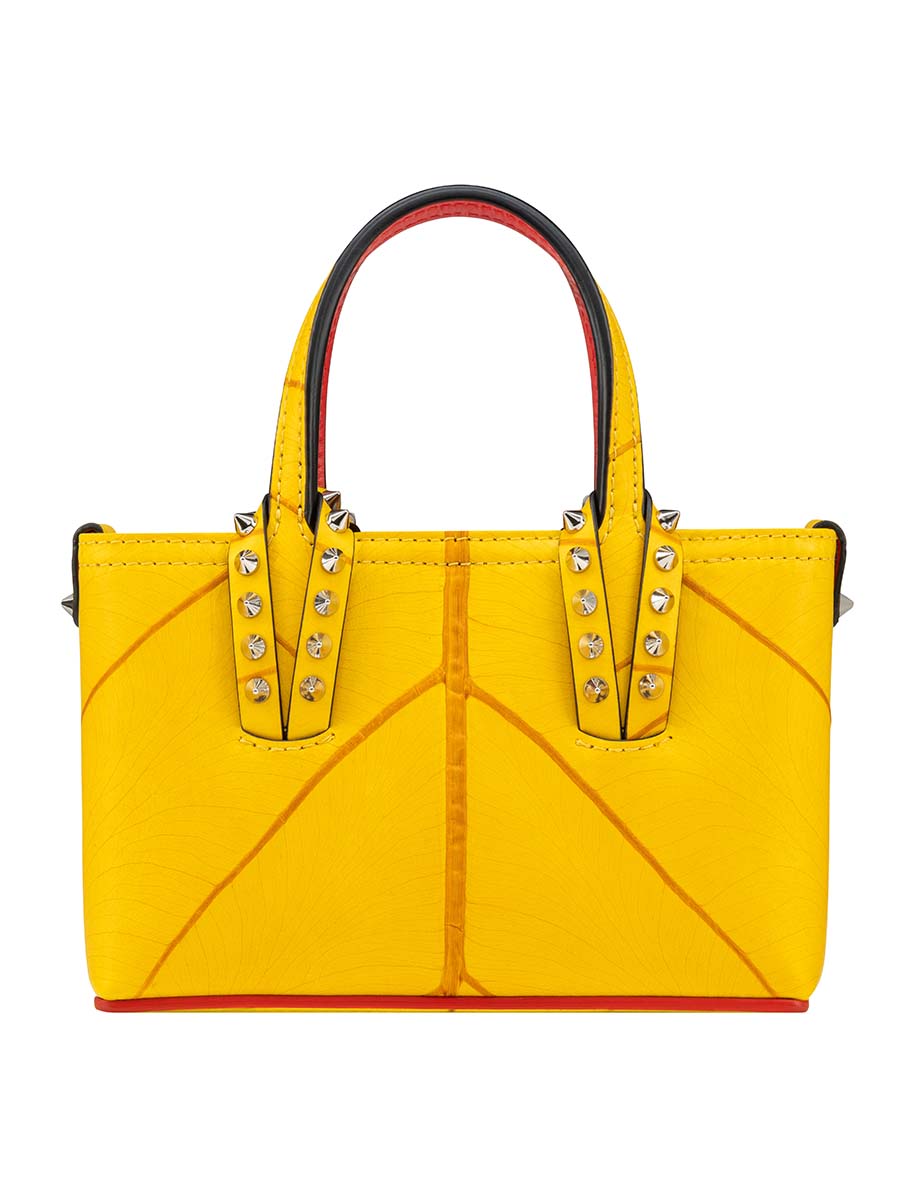
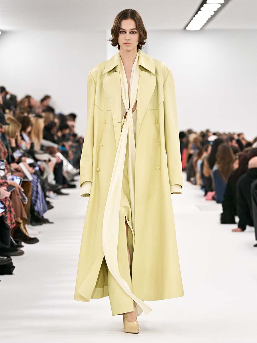
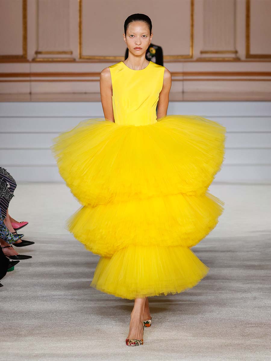
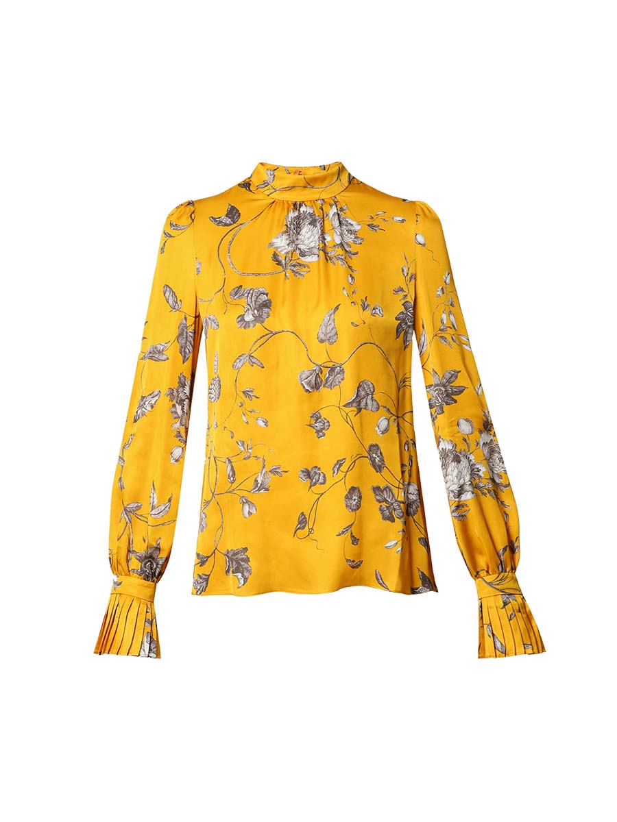
A motivating hue that is connected to intelligence, wisdom and creativity. It is considered the most optimistic for its link to the sun’s colour and the natural energy that emanates from this shining star. It can be playful in small doses, but it can also be overwhelming or anxiety-inducing in large amounts.
ORANGE: EXCITEMENT AND ABUNDANCE
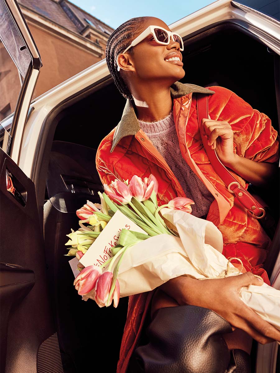
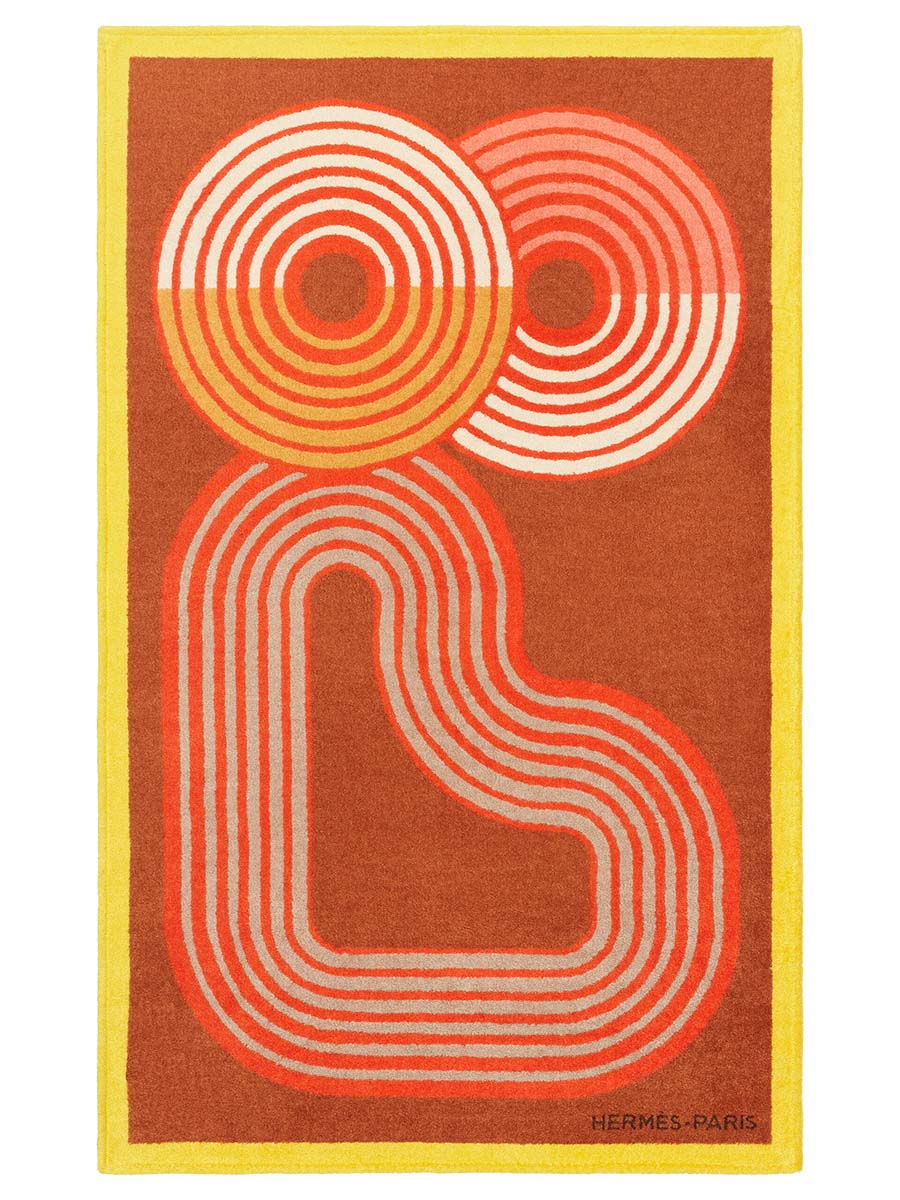
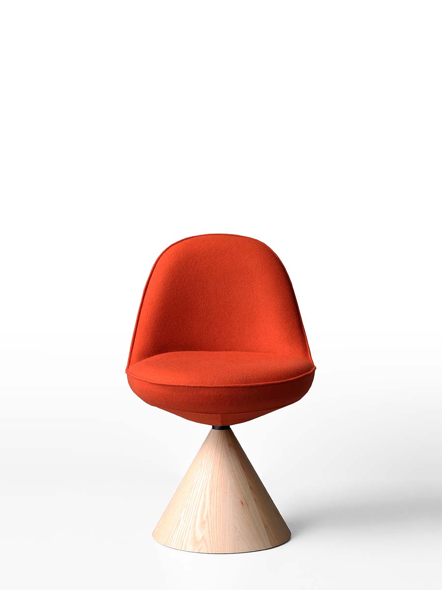
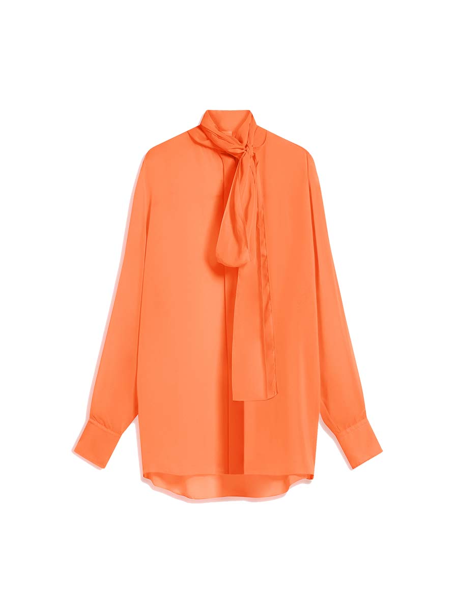
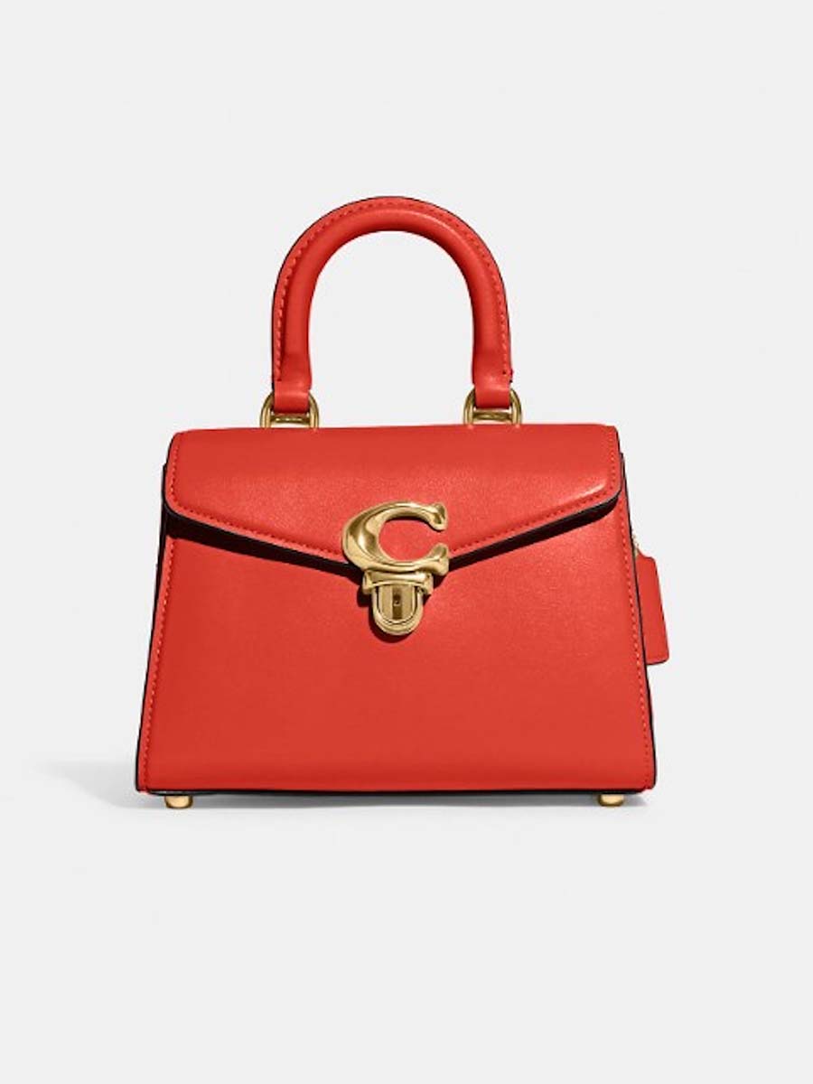
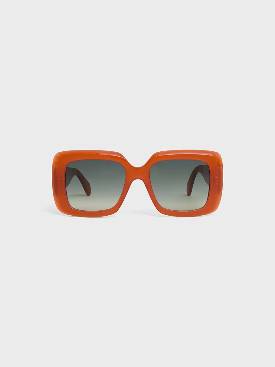
A vivid shade that is known for its stimulating effects. It is said to trigger feelings like enthusiasm and enterprising actions. Its revitalising nature is also believed to raise the amount of oxygen that goes to your brain, making you livelier and ready to move. On the other hand, it can also increase your appetite.
GREEN: BALANCE AND JOY
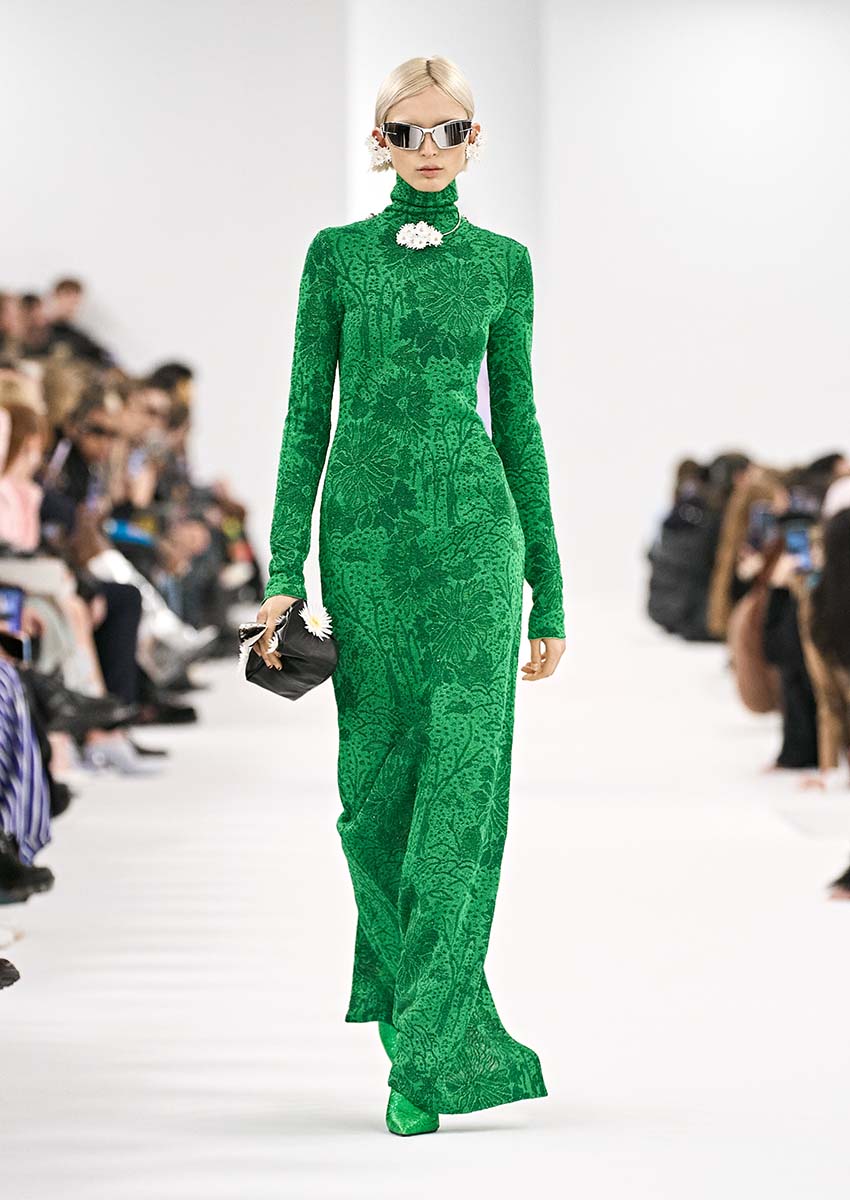
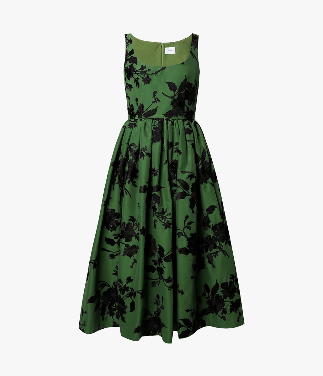
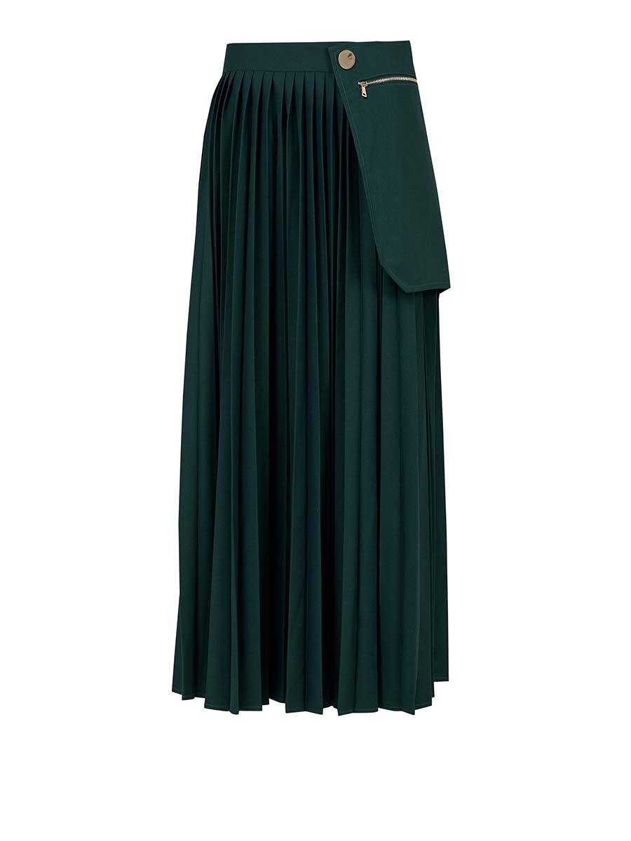
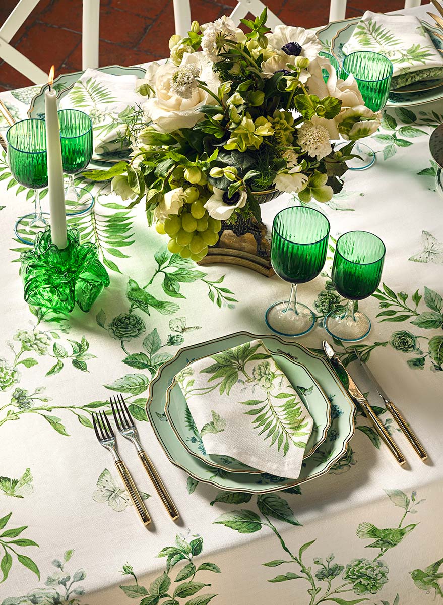
Because of its association with nature, it can improve your mood if you are feeling sad or hopeless. It is considered to bring equilibrium to your days and encourages you to be independent and make changes. Green is also said to stimulate wisdom, hope and strength. In terms of physical effects, it is believed to slow heart rate and help preserve energy.
BLUE: CALMNESS AND PEACE
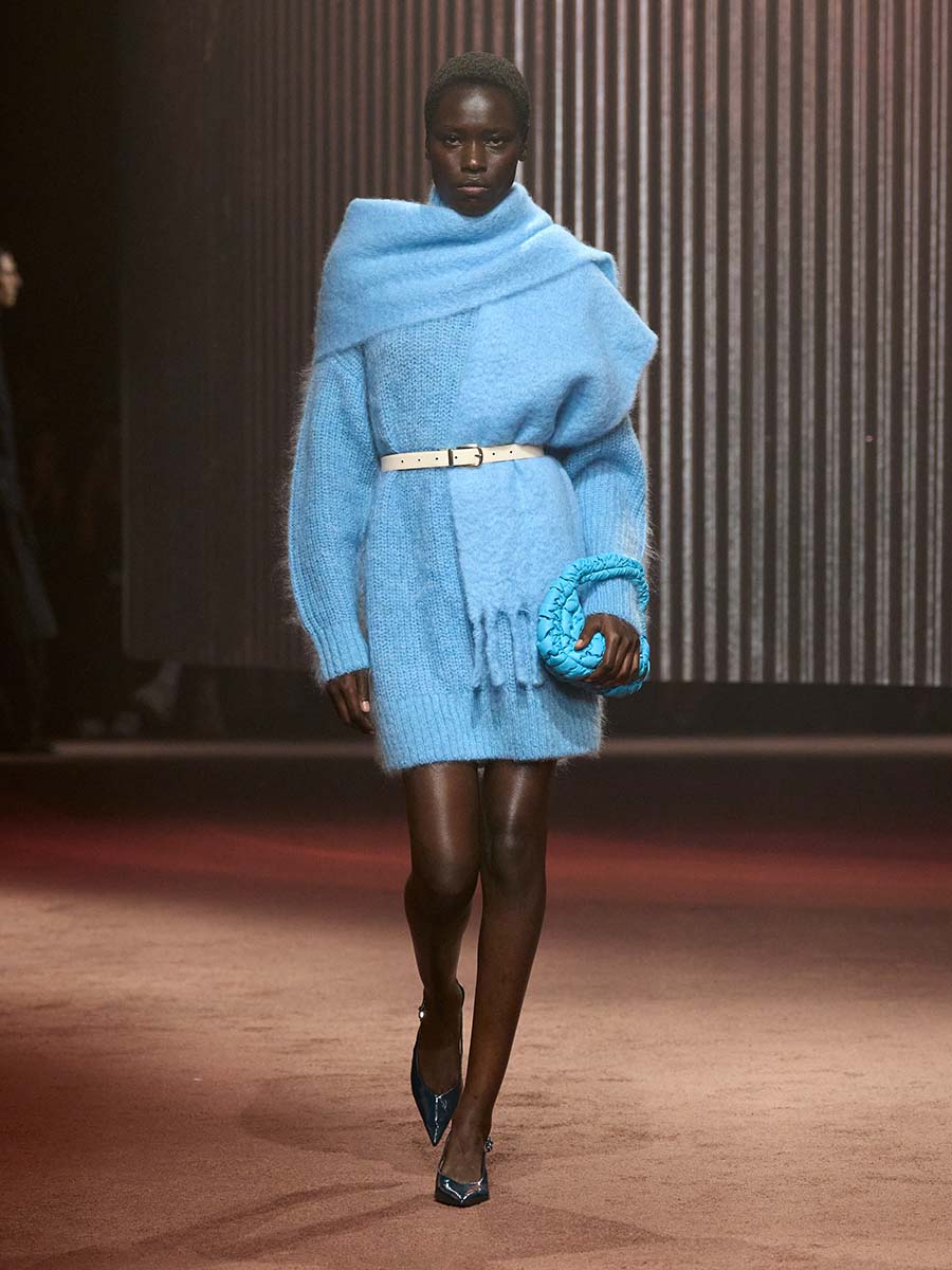
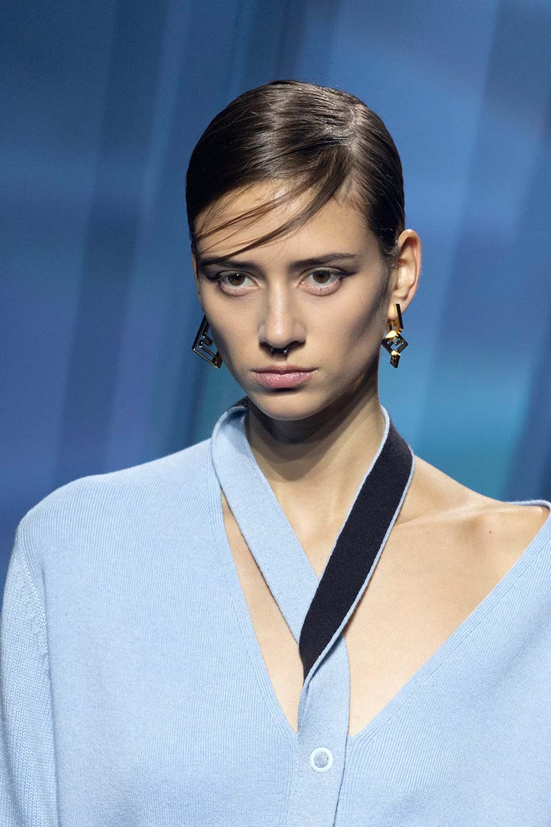
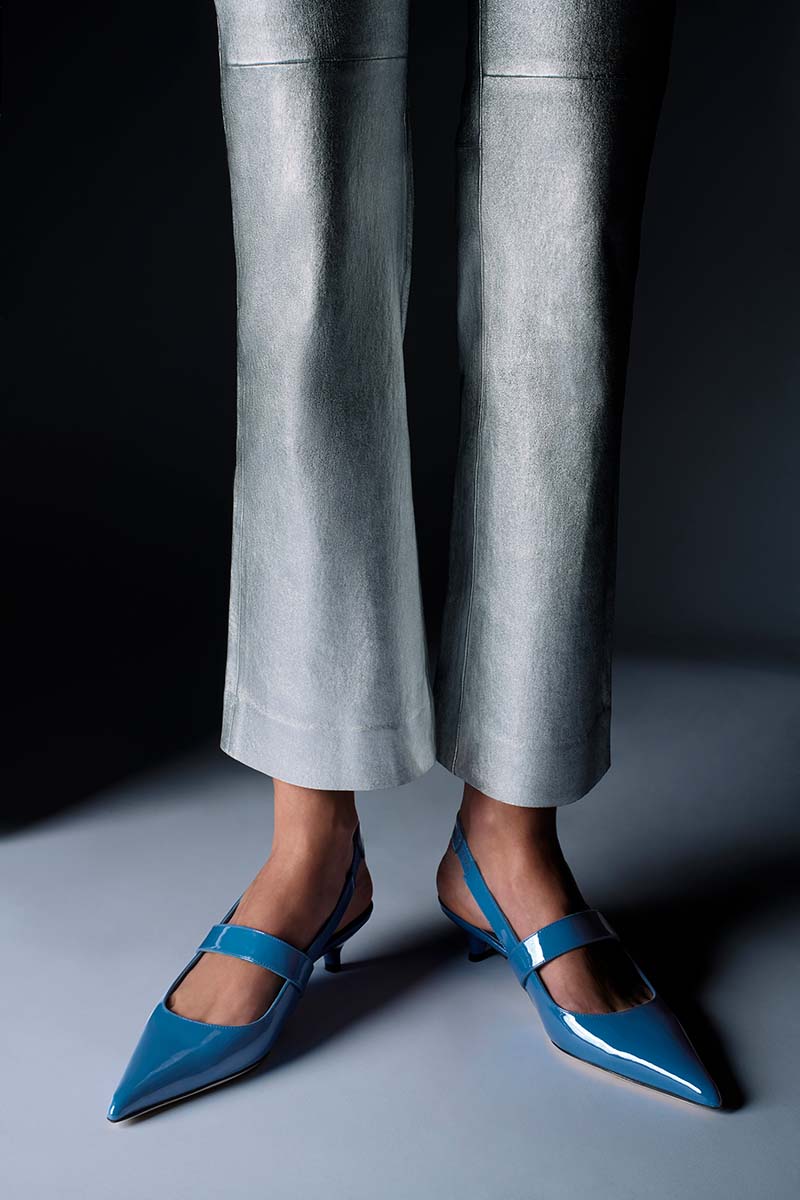
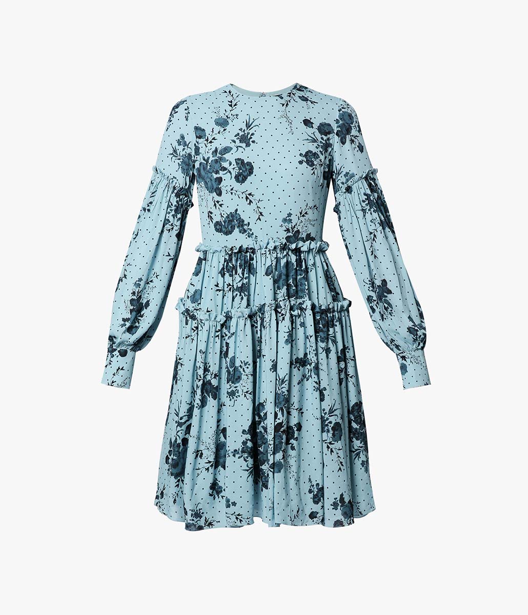
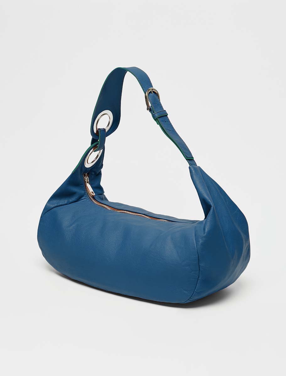
Blue is considered the most soothing colour of them all. It is usually used in therapeutic settings for meditation and relaxation. It is said to help unwind, making you more comfortable expressing your inner feelings. Light blue is associated with serenity and can help with insomnia. However, dark tones can provoke feelings of loneliness and lethargy.
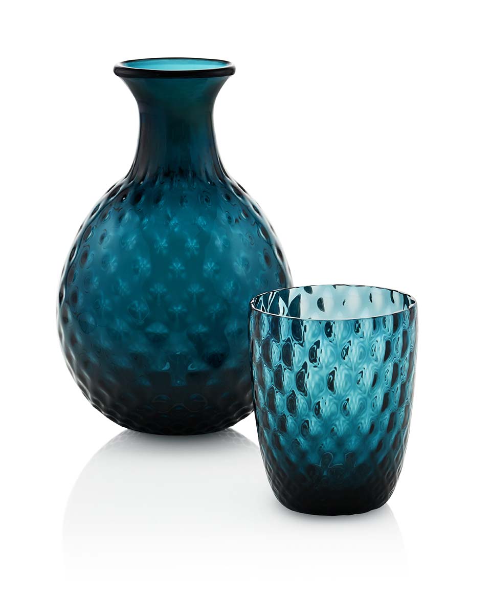
GREY: COMFORT AND MATURITY
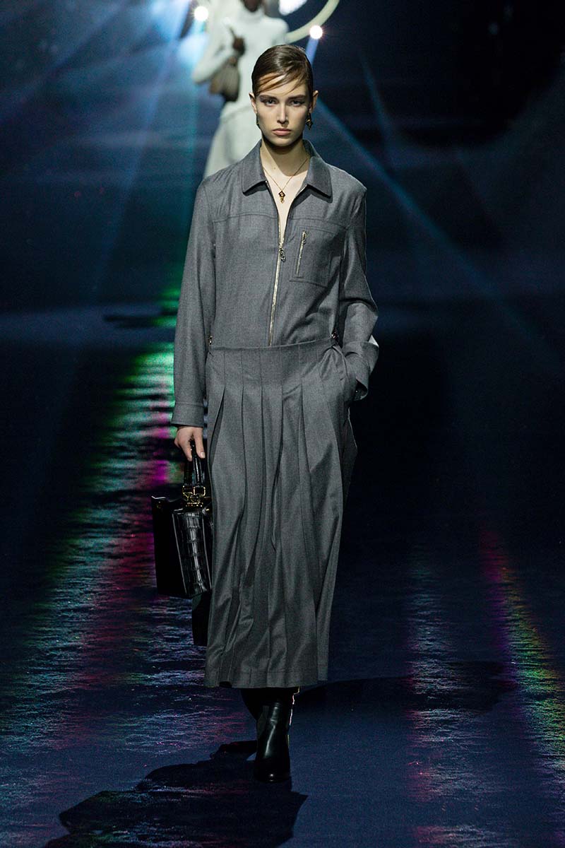
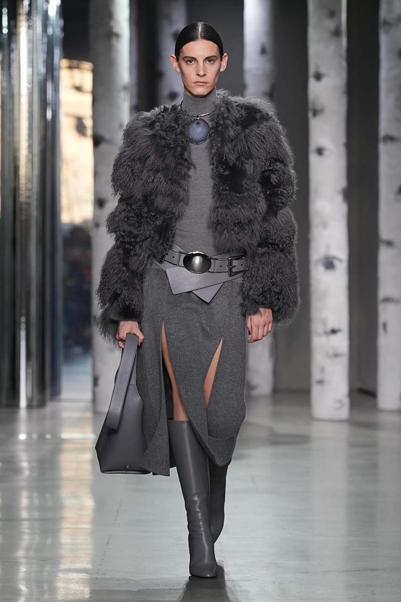
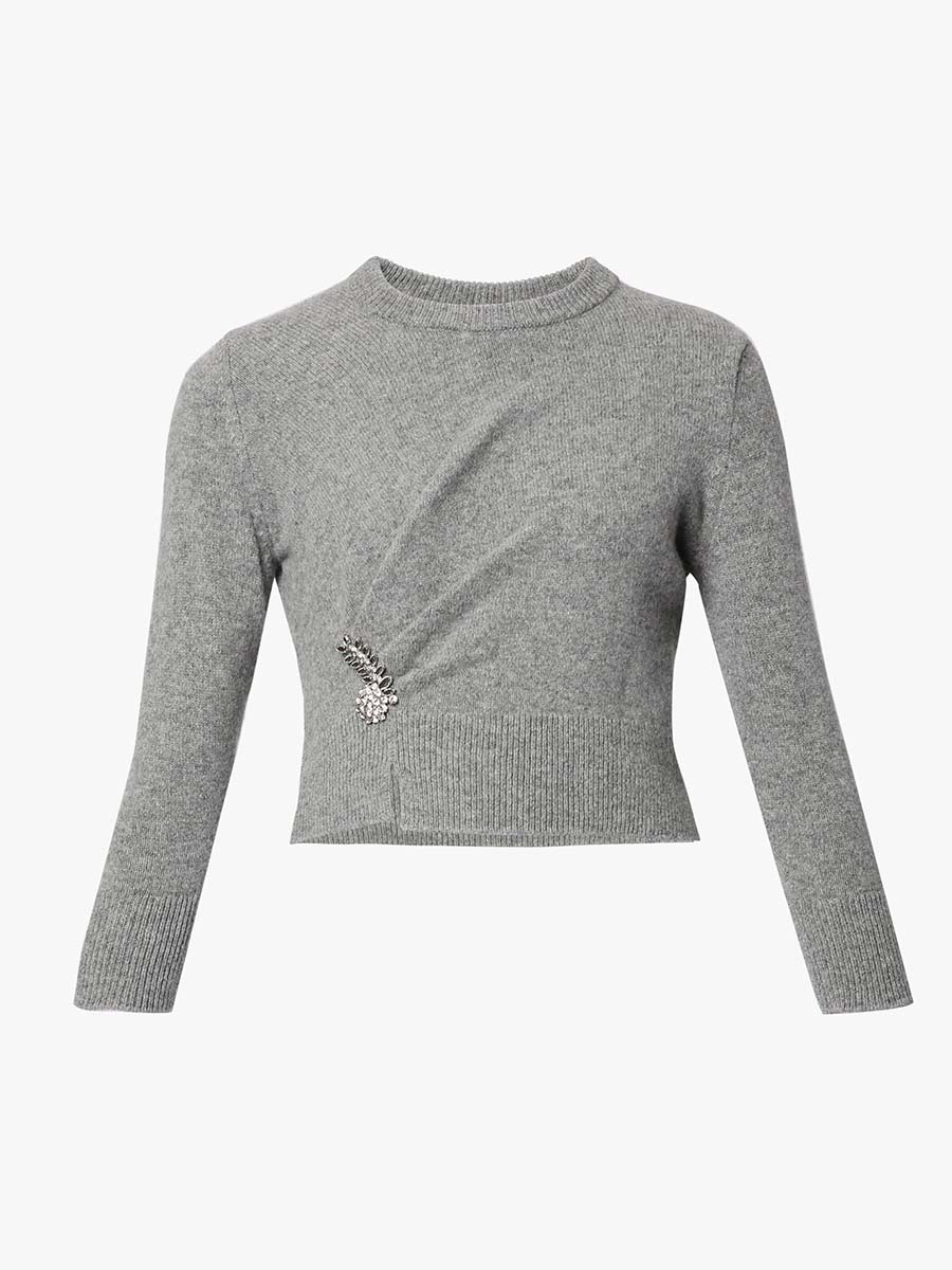
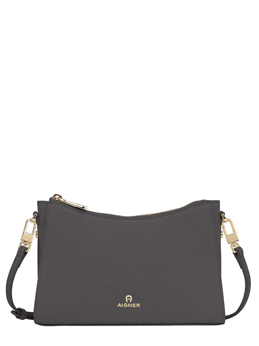
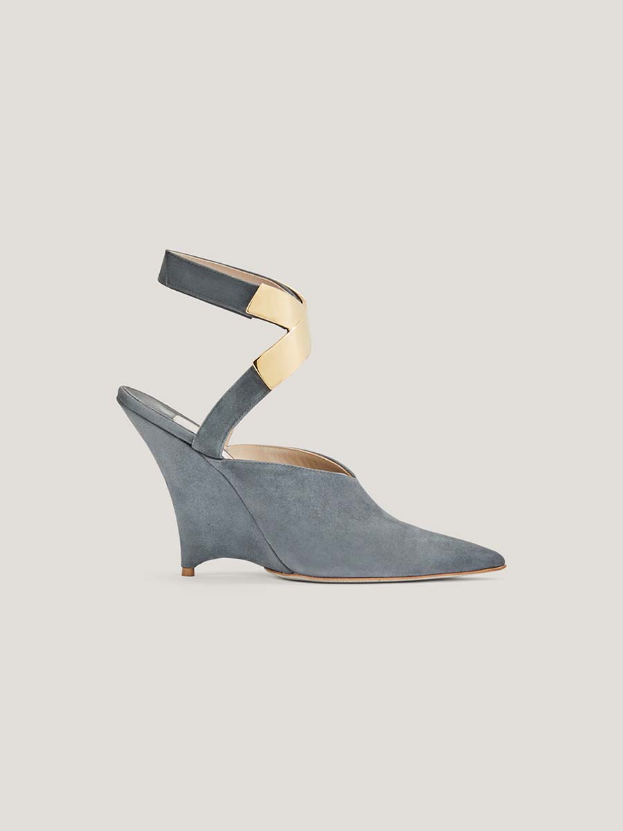
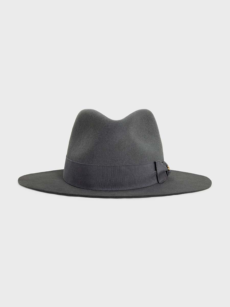
It is considered the most neutral shade in the colour wheel – sometimes associated with self-restraint or conformism. But it also expresses sleek sophistication and modern style. It is said to emanate a calming, unemotional effect. Darker shades may make you feel moodier, while lighter tones will give you a sense of hopefulness.
BROWN: RESILIENCE AND SECURITY
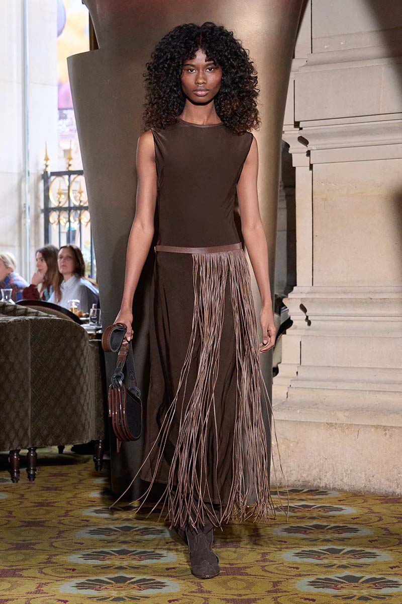
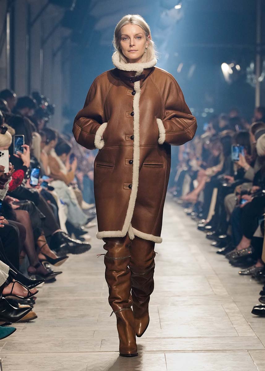
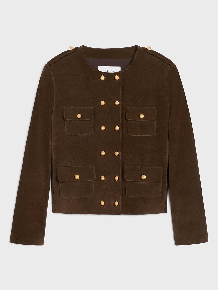
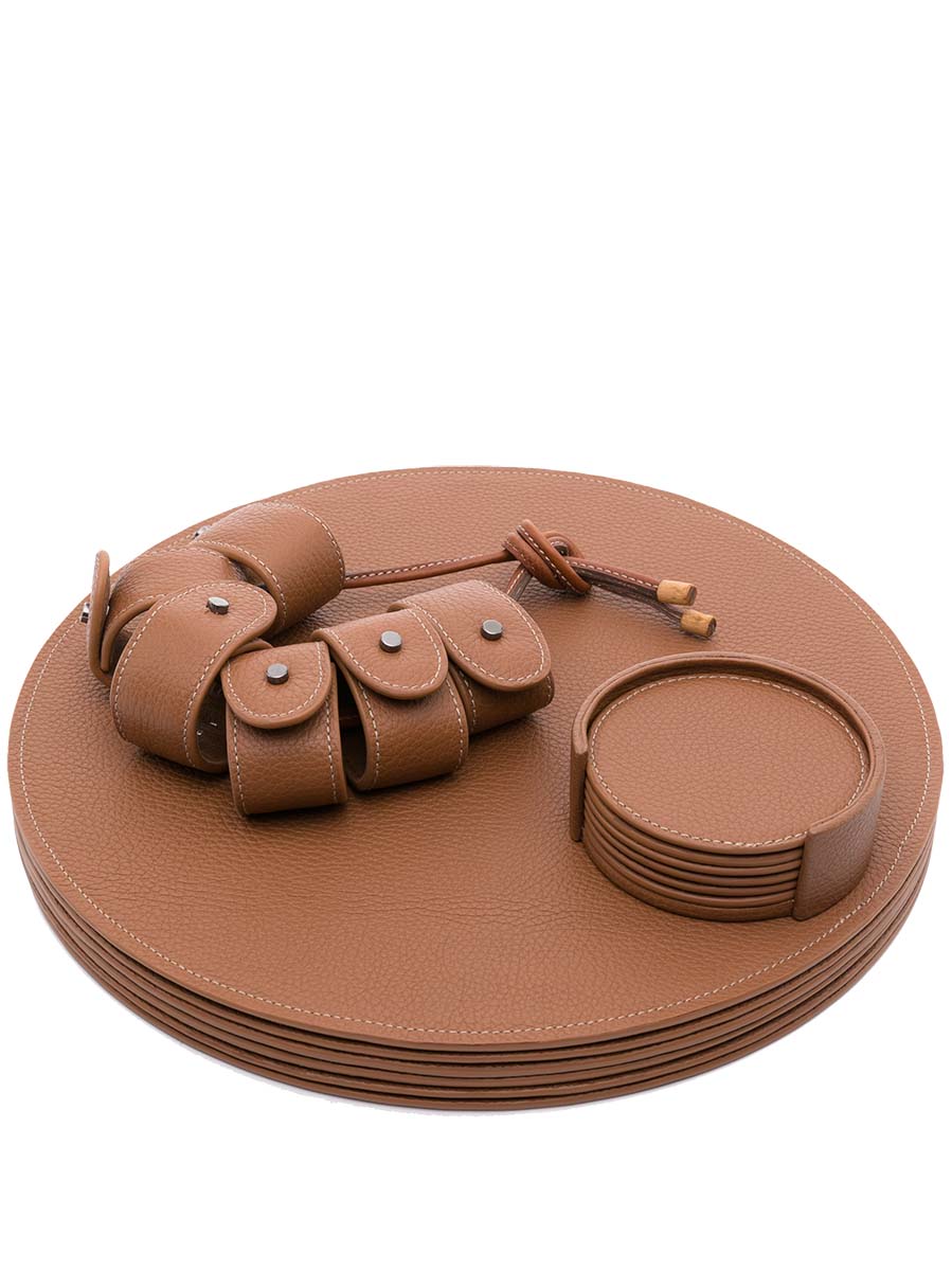
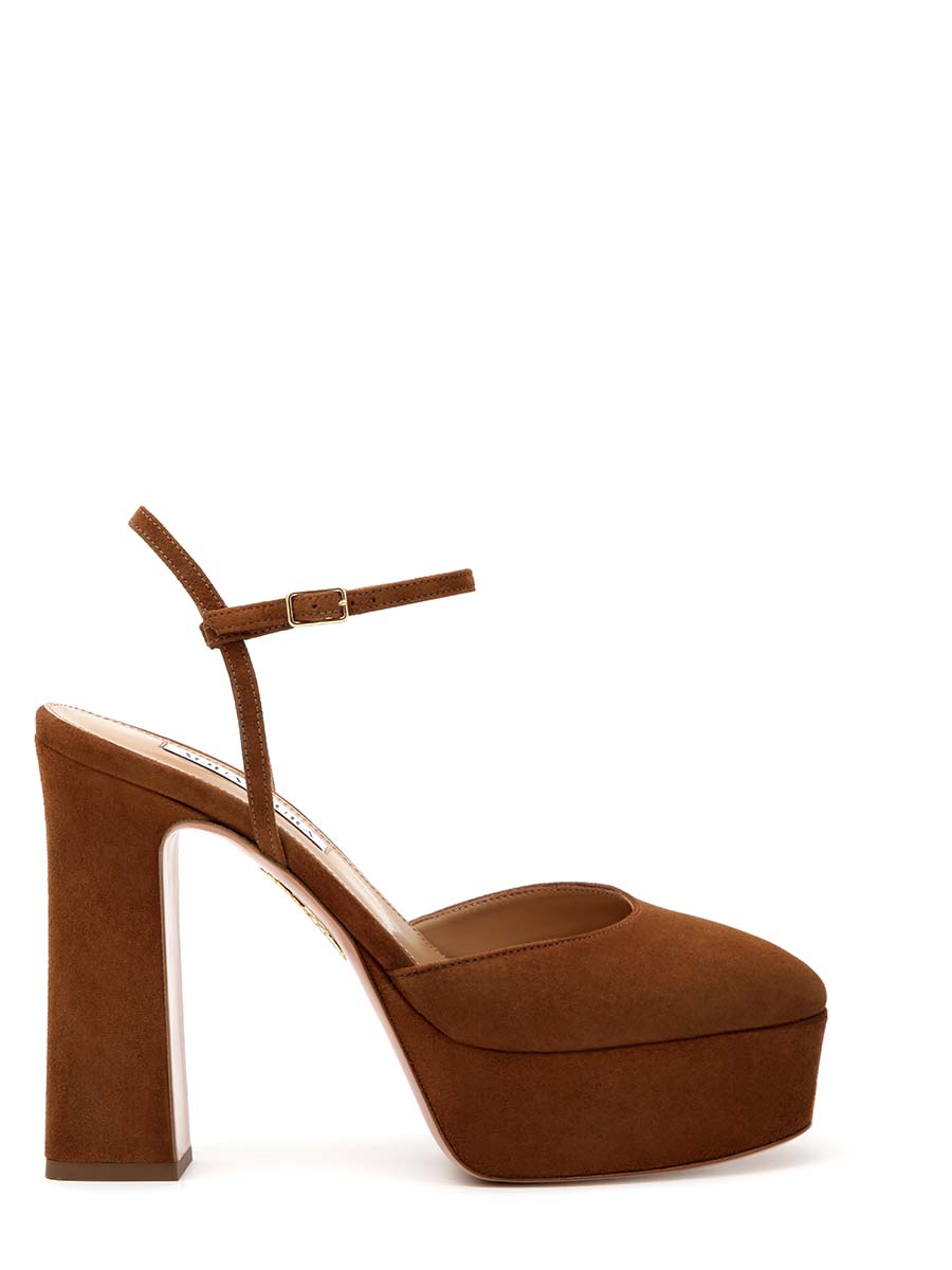
As a grounding, neutral colour, it prompts a feeling of safety. It doesn’t stand out much on its own, but it can be a good base for whatever other shade you would like to add, bringing a sense of stability to bright, energetic hues such as yellow and orange. Brown reminds people of their basic necessities and core values. It is also believed to improve serotonin levels.
WHITE: CALMNESS AND HOPE
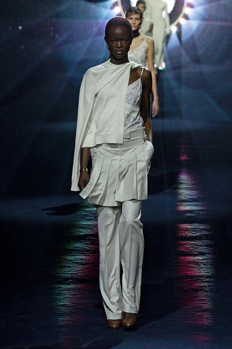
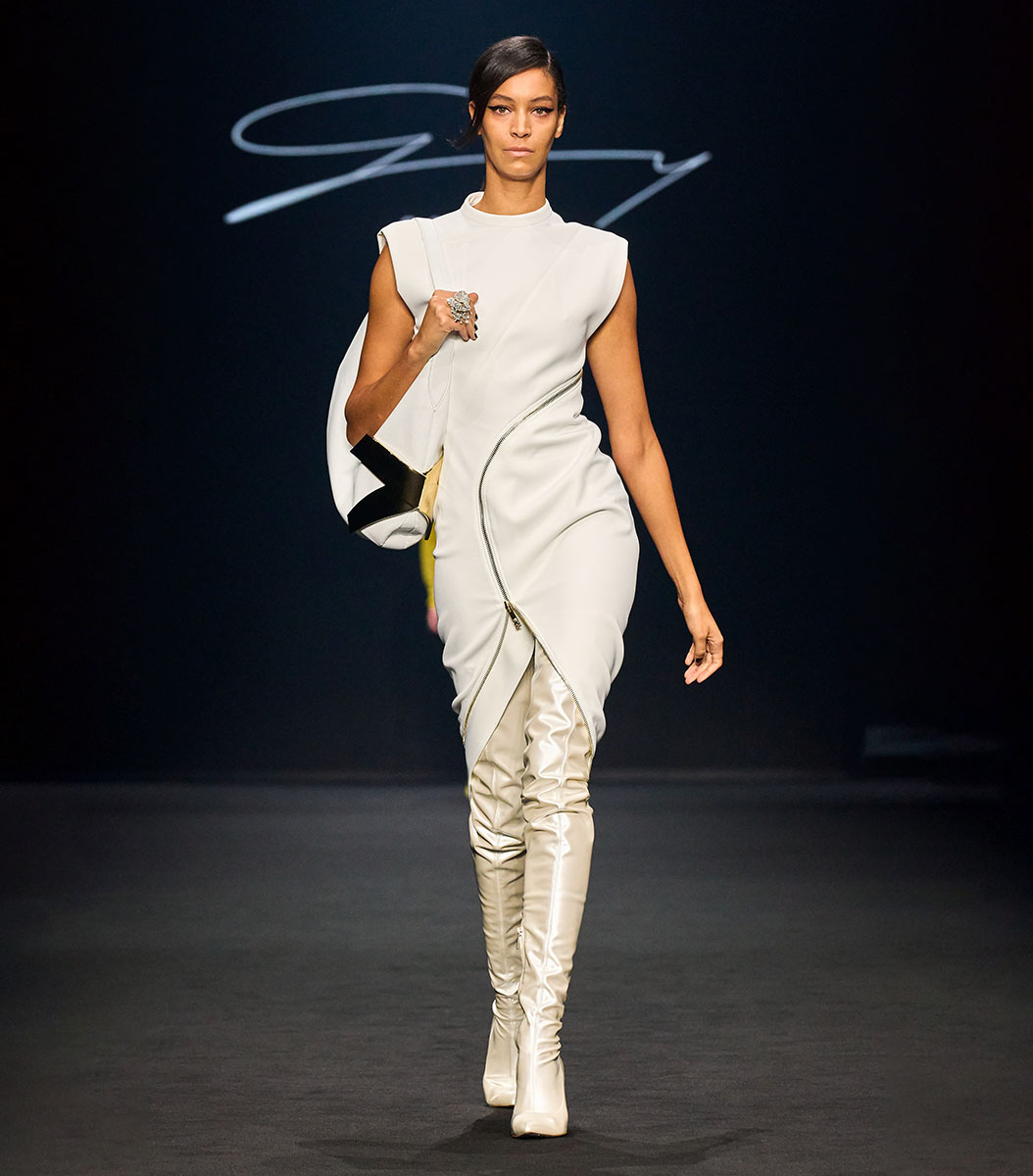
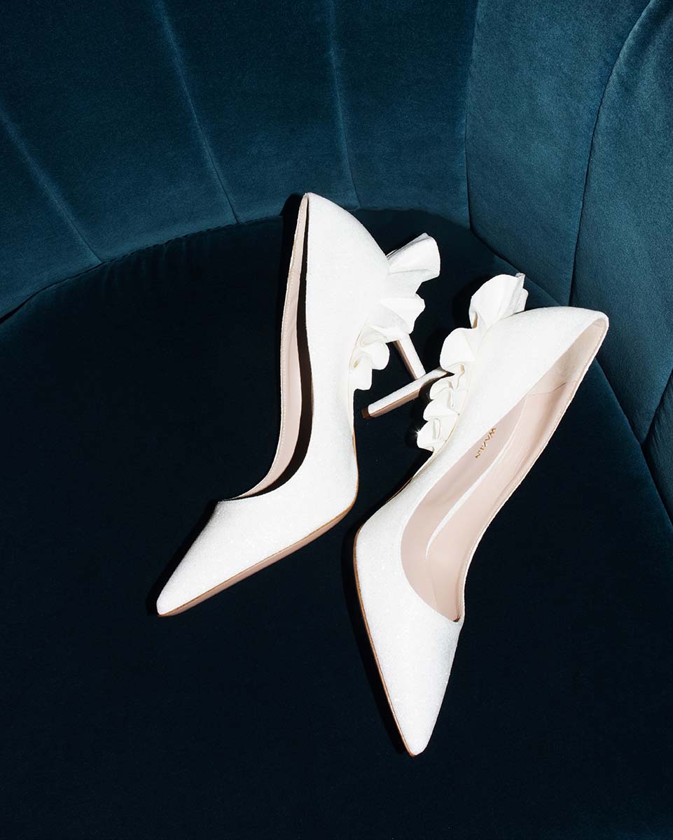
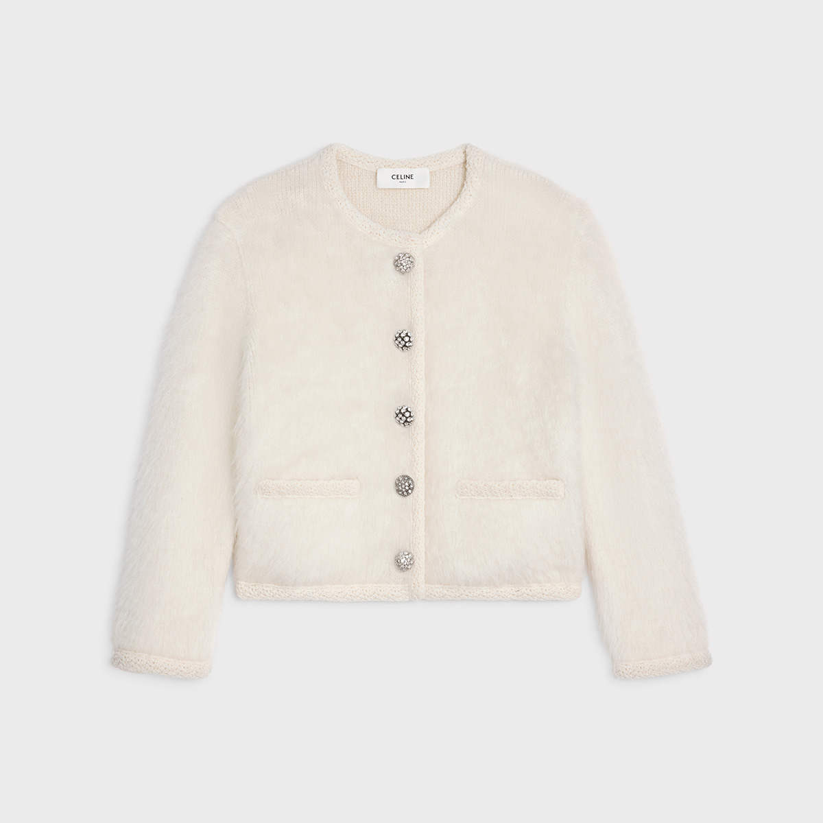
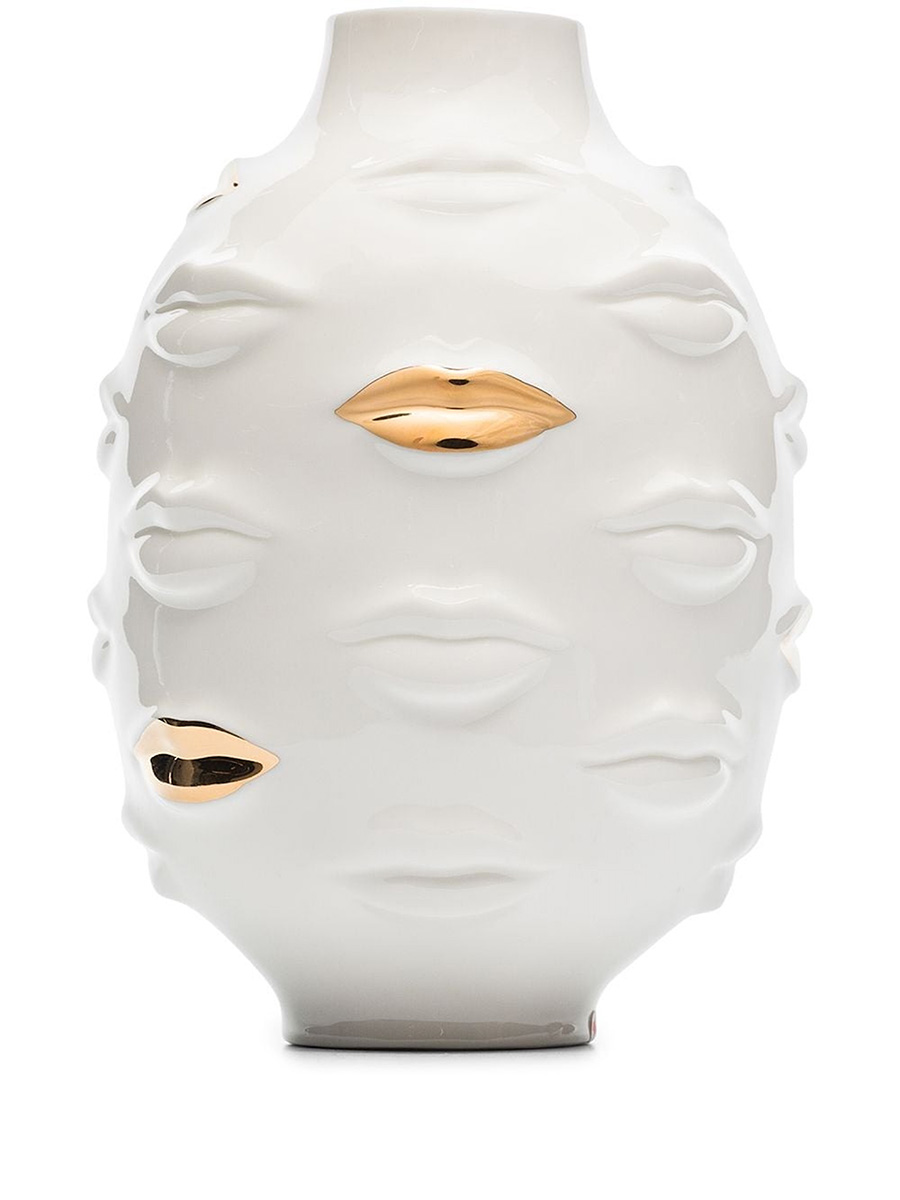
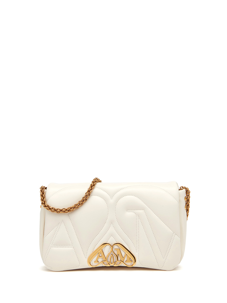
It is associated with purity and innocence and represents new beginnings (maybe that’s why it is chosen for bridal gowns and to celebrate New Year’s Eve in many cultures). It has a decluttering effect and makes you feel more refreshed and organised. It also enhances focus and memory. However, too much white can feel sterile and lonely. Balance it out with other colours.