Interior design embraces trends, not with new collections every season (as happens with fashion), but a few new concepts become more popular every year. We bring some of the 2023 trends worth exploring to revamp your home – we anticipate that maximalists will be pleased!
BULKY MARBLE
Marble tops are usually used as thin pale surfaces, but things are changing and now we see statement, chunky marble pieces conquering the hearts of many. The altered approach to this material creates a bolder effect. You can have a broad marble vanity top to hold your washbasin or thick kitchen countertops and tables.
However, not only has the width become a highlight, but this statement element is also coming in different colours, with lots of veining and patterns imparting a retro feel. The trendy shades and types are funky marbles in Irish green, red Rosso and Levanto marble, red Travertine, Calacatta Viola and many deep black hues. Your countertops will become the eye-catching element of your bathroom and kitchen.
COLOUR OF THE YEAR
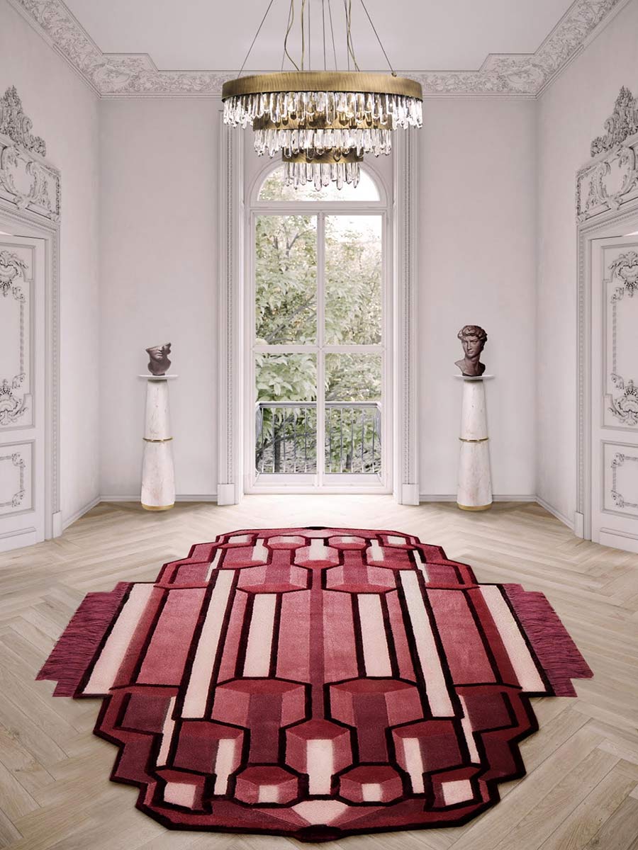
Pantone is an international authority on colours, and they select a hue to reign every year. For 2023, Viva Magenta (a mix between red and violet) is the chosen one. The bold hue and its variations have been an inspiration to many designers and you will spot it in many areas, such as fashion, beauty and, of course, interior design. It has a chameleon effect when white, grey or black additions are used for tint, tone and shade differences. From Viva Magenta, you obtain Terra Rosa, rusty pink, brownish tones and a magnificent palette of warm colours. You can paint a wall in this shade or add accessory elements to your rooms.


LOOK UP
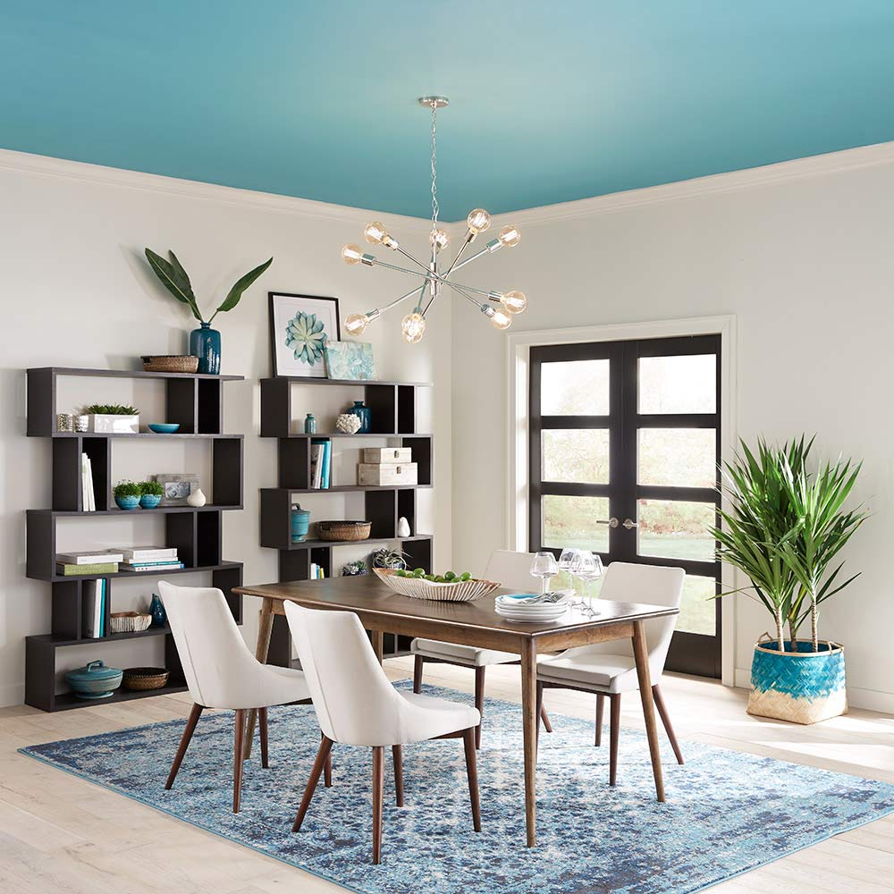
It is common to see one wall painted in a different (usually vivid) shade as a focal point in a room, but the trend now is to paint the ceiling – just the ceiling! You can still paint the whole space if you want a dramatic effect, but adding colour to the highest wall in a room is more intentional and allows your eyes to flow into the whole area and notice more details. If you choose a dark shade, it will give the sensation that the ceiling is higher than it actually is.
WELCOME NATURE
Biophilic design is a concept that aims to increase connectivity with the natural environment through the use of direct or indirect elements of nature. The trend incorporates sinuous shapes inspired by organic items and invests in open areas to welcome the outside in. Not only do furniture and spaces attract a connection with mother nature , but also materials such as cotton, wood, terracotta, marble, ratan, ceramic, linen and raw texturised surfaces are used to compose interior design perceptions. Another way to bring nature indoors is to add plants in clay vases, hanging greenery and vertical gardens to your décor. Plastic and industrial products are banned!


UNIQUE SLABS
Handmade ceramic tiles are attracting a lot of praise, mainly the precious ones made by tile artisans (yes, they still exist), where all the steps from mould to firing and glazing come to life by a slow artisanal process, and no tile is exactly the same as the other. It celebrates the quintessential beauty of imperfection.
The only downside to them is that they are undoubtedly costly. However, if you still want the artisanal look, you can go for the industrial ones that carry a rustic finish. Why should you use them? To obtain a tridimensional effect and add organic texture. Venture to treat a wall or the hall floor area with handmade tiles – they will become the undiscussed protagonist of the space.
MOODY ROOMS
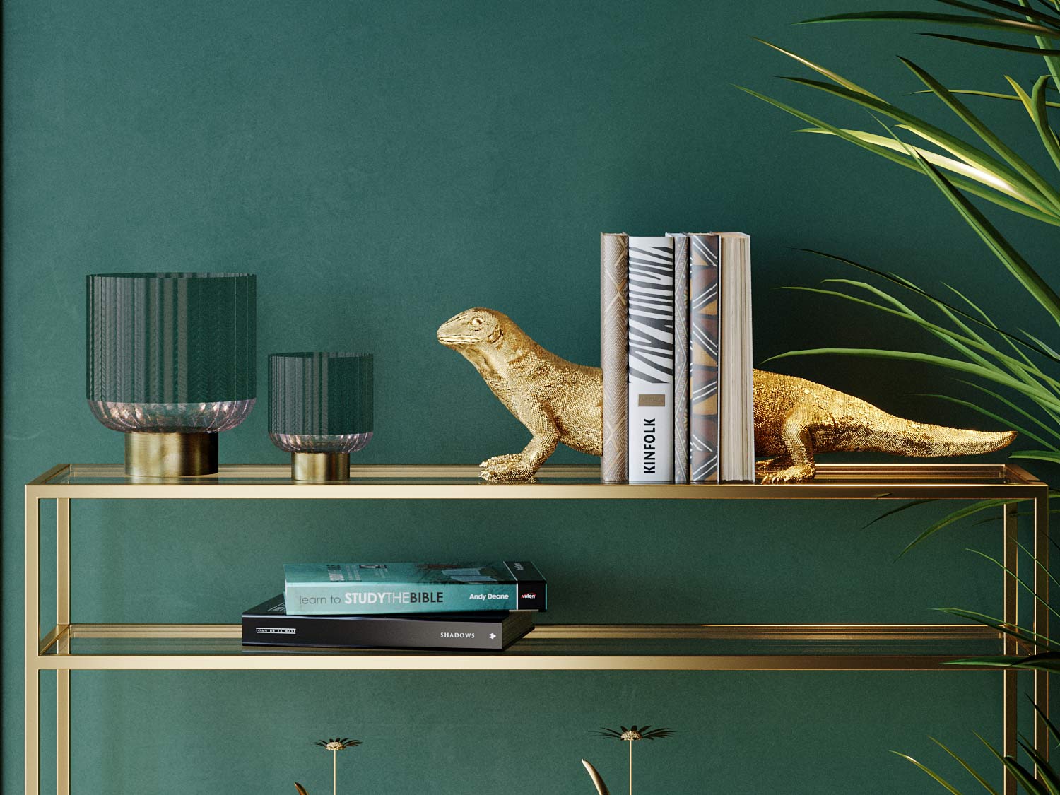
As the name suggests, these interiors invest in a dramatic atmosphere and use a dark-hued colour palette, but not specifically black. This style mostly uses sombre shades of greys, greens, reds and blues. The biggest fear of going for this style on the walls (and ceiling) is that it will make the space look smaller, but that’s not entirely true. Deep colours help blur the lines between the walls, making the room seem bigger because you can’t really identify where a wall begins or ends.
Why go dark? The area becomes classy without much effort and there’s a distict touch of wow! It adds drama and elegance while giving character to your space and a mysterious vibe that you don’t get with lighter palettes. It also provides a sense of intimacy and a relaxing feeling (lighter tones are full of energy). It helps create that cosy vibe we all look for in our homes.
For more design inspirations, connect with
@sagevanmarmi, @natuzzi, @chattelsandmore,
@brabbu and @verywooditaly


